This has been percolating in my head for a bit so figured I might as well get it out =). One of the best apps for the iPhone is Sudoku2 by fingerarts. If you aren’t familiar with the Sudoku here is a screenshot.
 Each of the smaller boxes needs to have just one of the numbers 1 – 9 while each line vertical and horizontal line can also only have just one of the numbers 1 – 9. It really becomes a process of elimination based on the number you are trying to solve for and where it can go. For example, when I took the screenshot I was solving for 1s. Take a look at the bottom left box. Based on the intersection of other 1s, the 1s in this box have to be in the first vertical column although it isn’t known which of the two it might be (yellow cirlce). Because the ones are in that column though if you look at the top left box there is only one open box where the 1 could go (black 1). By filling that in there is only one open square in the top right square (red 1). And on you go through all the numbers.
There was always a tickle in the back of my mind that there was a security analogy with Sudoku but it didn’t really hit me until a few months ago when I was trying to figure out a way to create a metric-y type view of some virus and incident data.
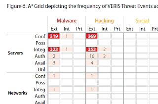
My mind wandered back to one of the charts in the Verizon Data Breach Report. Specifically figure 6 in the 2011 report. Here is a corner of that chart due to size.
Now, one of the points they make is look at all the whitespace. Only 55 of 630 possible intersections are represented across their caseload. In fact in many respects the whitespace tells a story of its own.
Based on your maturation level your incidents might not have detailed root cause buckets like theirs. That said I’m a pretty firm believer that given some data I could probably find something of value and at the end of the day you start where you start. If all you have is IPS or AV then use it. As a proof of concept for this approach I sliced off a month’s worth of AV data. Similar to the Verizon chart I broke the X and axis into two levels. For the X axis that was OS grouped by Windows servers (2k3, 2k8, etc), Windows desktops (XP, 7), and other (Mac, Linux, etc). For the Y axis I broke that into what the AV categorized the infection as: jokeware, adware, malware, etc with a sub breakdown by action: deleted, cleaned, quarantined, left alone. I only counted each computer one time per av category and action. In other words if a computer was hit by 2 jokeware infections that were deleted it was only counted 1 time. There are obvious issues with this approach as your time slice gets larger but it is a place to start.
The results were pretty interesting. Not only did particular OS, infection types, and AV action trends start emerge from the numbers but they also emerged from the whitespace! Part of the draw to me about this view is several questions immediately sprang to mind which, to me, is part of what metrics are supposed to do.
So after all that I guess it really isn’t playing Sudoku….although I have wondered about putting something like this view of AV data alongside a similar breakdown of IPS or other defensive devices almost like the multiple adjacent squares in Sudoku to see what could be seen.

No comments:
Post a Comment